
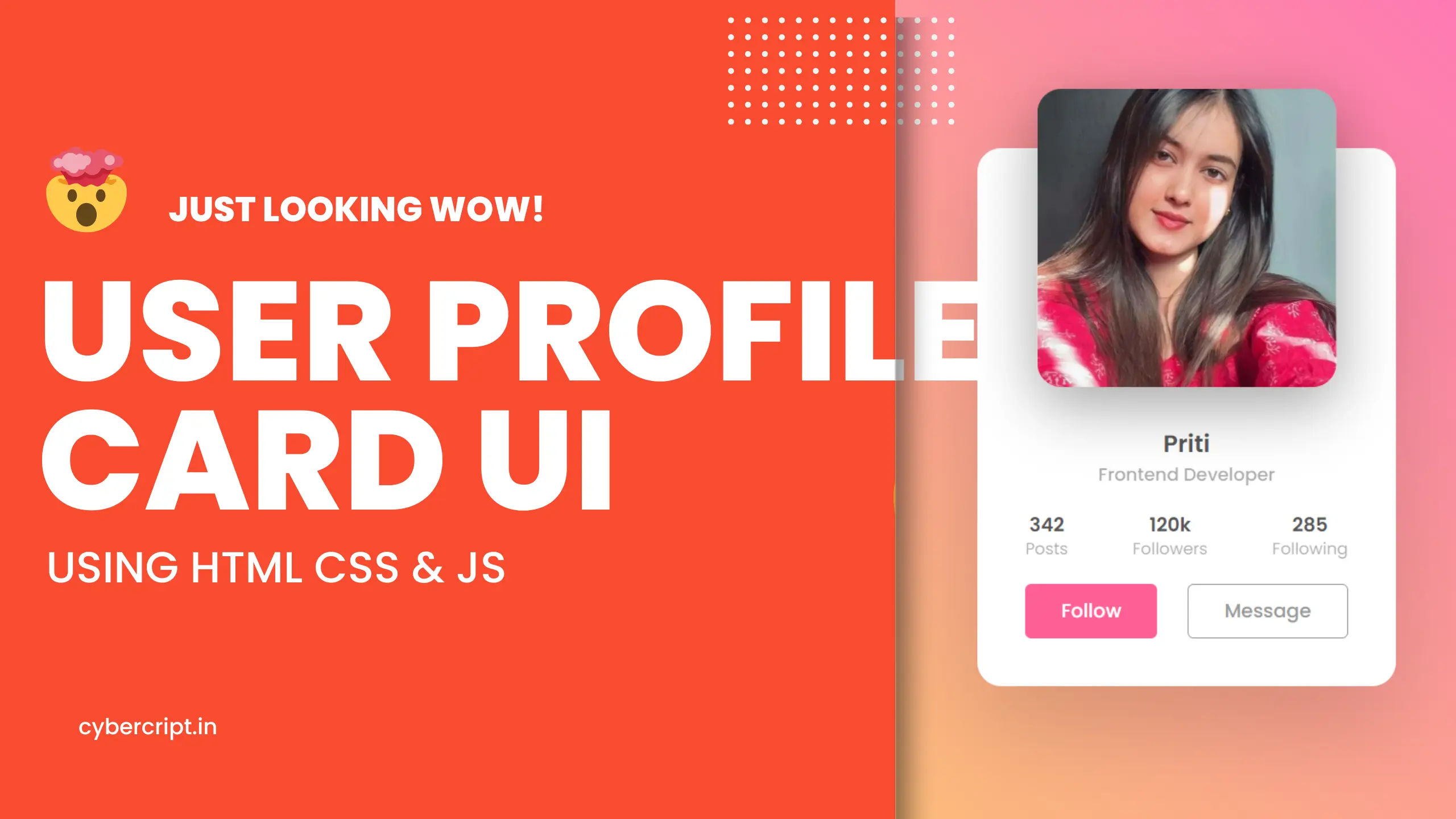
Introduction to the world of web designing, we will create an animated profile card design using HTML & CSS. It is important to create a user interface that will engage your audience and attract them visually. You can make the visitor’s experience even better by having an animated profile card on your site as this will bring in interactivity, style, and creativity at once. Here, in this article, we will walk through how you can create an animated profile card using HTML and CSS, showing you how to combine aesthetics with practicality.
- Animated hover effect
- Attractive clickable buttons
- Creative color feel
- Easy to use
- Use profile picture
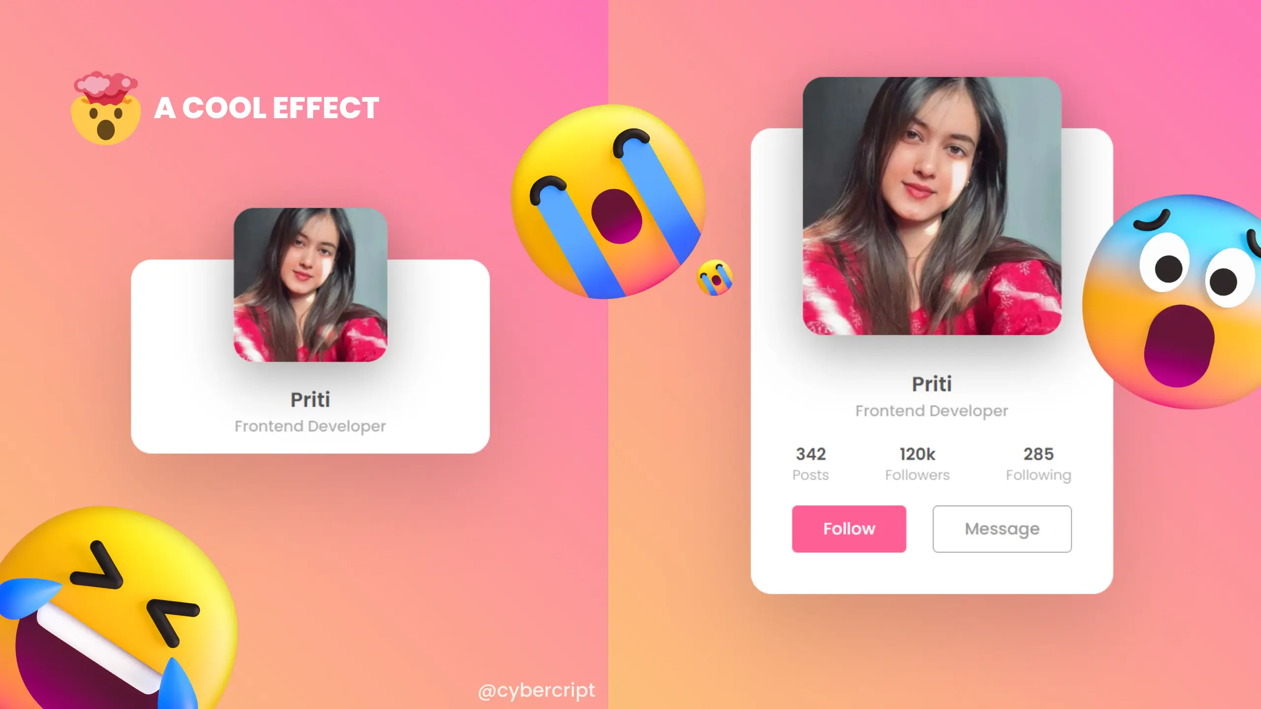
To make this profile card we add more interactivity using css and js. These micro intractions are more helpful for use. When a site is interactive, there are a lot of chances to rank this site and looks more creative. To create this profile card we take inspiration from awarded websites.
SOURCE CODE
HTML:
<!DOCTYPE html>
<html>

<head>
	<title>USer profile card</title>
	<link rel="stylesheet" type="text/css" href="css/style.css">
	<!-- coded by : cybercript.in -->

</head>

<body>
	<div class="card">
		<div class="imgBx">
			<img src="images/profile-pic.jpg">
		</div>
		<!-- coded by : cybercript.in -->

		<div class="content">
			<div class="details">
				<h2>Priti <br><span>Frontend Developer</span></h2>
				<div class="data">
					<h3>342<br><span>Posts</span></h3>
					<h3>120k<br><span>Followers</span></h3>
					<h3>285<br><span>Following</span></h3>
				</div>
				<div class="actionBtn">
					<button>Follow</button>
					<button>Message</button>
				</div>
				<!-- coded by : cybercript.in -->

			</div>
		</div>
	</div>
</body>
<!-- coded by : cybercript.in -->

</html>
CSS:
@import url('https://fonts.googleapis.com/css?family=Poppins:100,200,300,400,500,600,700,800,900');

/* // <!-- coded by : cybercript.in --> */
* {
	margin: 0;
	padding: 0;
	box-sizing: border-box;
	font-family: 'Poppins', sans-serif;
}

body {
	display: flex;
	justify-content: center;
	align-items: center;
	min-height: 100vh;
	background: #efefef;
	background: linear-gradient(45deg, #FBDA61, #FF5ACD);
}

.card {
	position: relative;
	width: 350px;
	height: 190px;
	background: #fff;
	border-radius: 20px;
	transition: 0.5s;
	box-shadow: 0 35px 80px rgba(0, 0, 0, 0.15);
}

.card:hover {
	height: 450px;
}
/* // <!-- coded by : cybercript.in --> */

.card .imgBx {
	position: absolute;
	left: 50%;
	top: -50px;
	transform: translateX(-50%);
	width: 150px;
	height: 150px;
	border-radius: 20px;
	box-shadow: 0 15px 50px rgba(0, 0, 0, 0.35);
	overflow: hidden;
	transition: 0.5s;
	z-index: 10;
}

.card:hover .imgBx {
	width: 250px;
	height: 250px;
}

.card .imgBx img {
	position: absolute;
	top: 0;
	left: 0;
	width: 100%;
	height: 100%;
	object-fit: cover;
}
/* // <!-- coded by : cybercript.in --> */

.card .content {
	position: absolute;
	width: 100%;
	height: 100%;
	display: flex;
	justify-content: center;
	align-items: flex-end;
	overflow: hidden;
}

.card .details {
	padding: 40px 40px;
	text-align: center;
	width: 100%;
	transition: 0.5s;
	transform: translateY(150px);
}

.card:hover .details {
	transform: translateY(0px);
}

.card .details h2 {
	font-size: 1.25em;
	font-weight: 600;
	color: #555;
	line-height: 1.2em;
}
/* // <!-- coded by : cybercript.in --> */

.card .details h2 span {
	font-size: 0.75em;
	font-weight: 500;
	opacity: 0.5;
}

.card .details .data {
	display: flex;
	justify-content: space-between;
	margin: 20px 0;
}

.card .details .data h3 {
	font-size: 1em;
	color: #555;
	line-height: 1.2em;
	font-weight: 600;
}

.card .details .data h3 span {
	font-size: 0.85em;
	font-weight: 400;
	opacity: 0.5;
}

.card .details .actionBtn {
	display: flex;
	justify-content: space-between;
	gap: 20px;
}
/* // <!-- coded by : cybercript.in --> */

.card .details .actionBtn button {
	padding: 10px 30px;
	border: none;
	outline: none;
	border-radius: 5px;
	font-size: 1em;
	font-weight: 500;
	background: #ff5f95;
	color: #fff;
	cursor: pointer;
}

.card .details .actionBtn button:nth-child(2) {
	border: 1px solid #999;
	color: #999;
	background: #fff;
}
/* // <!-- coded by : cybercript.in --> */
JavaScript:
// <!-- coded by : cybercript.in -->

let btn = document.querySelector(".btn");
let clip = document.querySelector(".clip");
let video = document.querySelector("video");
let close = document.querySelector(".close");
btn.onclick = function(){
  btn.classList.add("active");
  clip.classList.add("active");
  video.currentTime = 0;
  video.play();
}
// <!-- coded by : cybercript.in -->

close.onclick = function(){
  btn.classList.remove("active");
  clip.classList.remove("active");
  video.pause();
}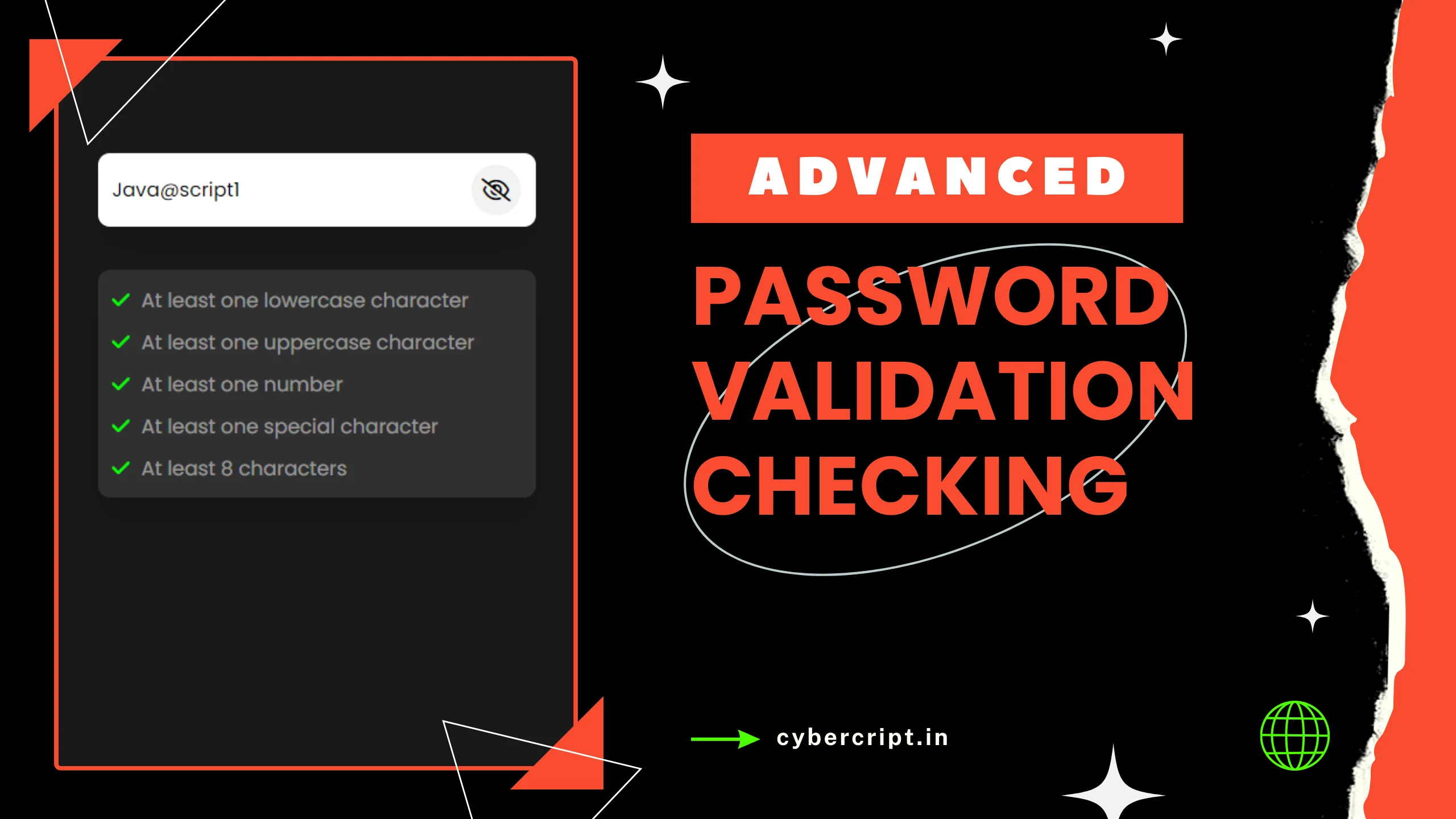
Advanced Password Validation Checking In JS
Today we will create a password authentication check using JavaScript. We will also …
Download Source Code
Conclusion:
And there you go – Animated Profile Card Design using HTML & CSS. You can modify the styles, extend them with new features, or use them in your projects to provide stylish visuals for the users.