
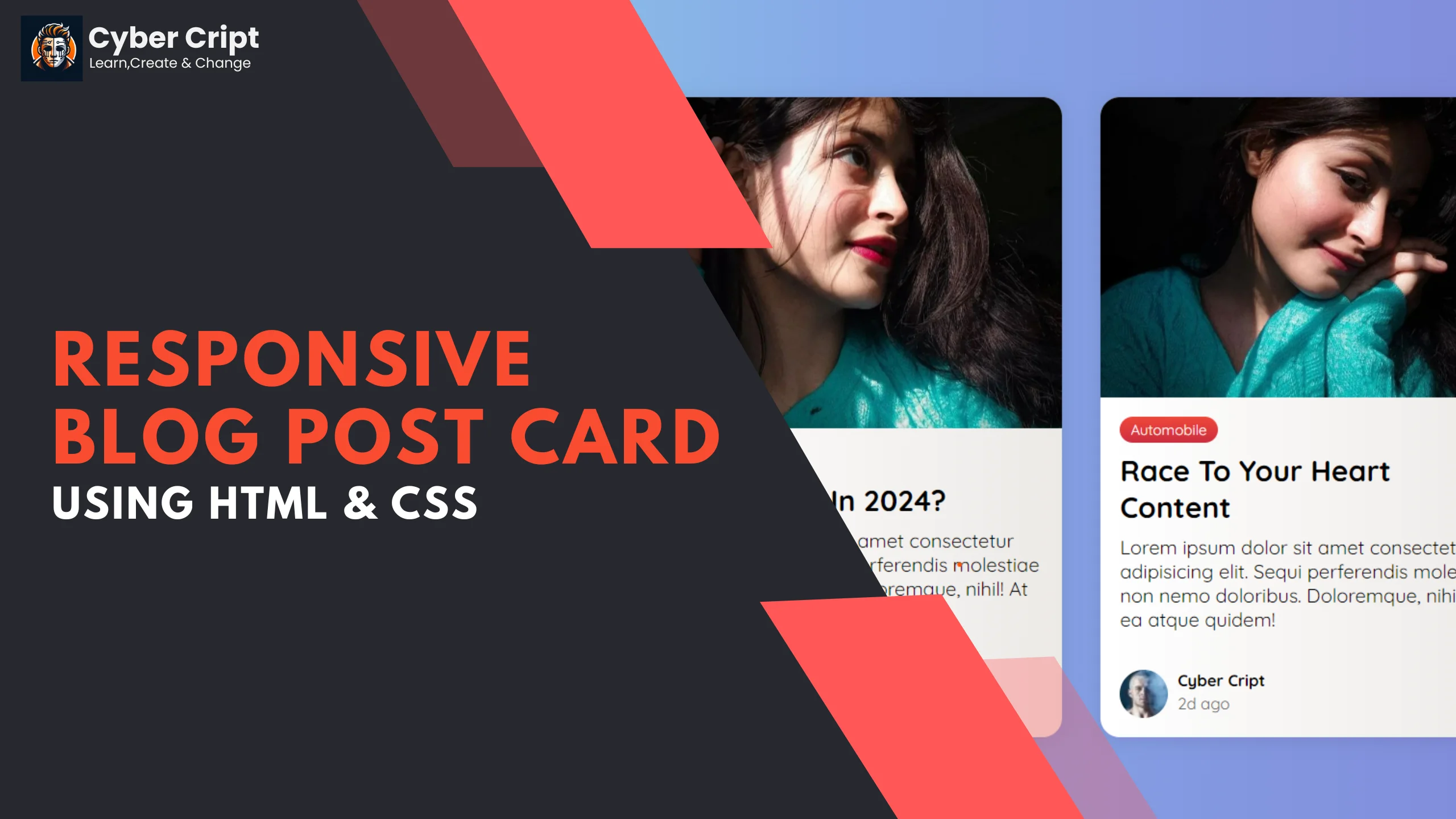
In this particular post, we will create a visually appealing and Responsive Blog Post Card Design Using HTML & CSS. This tutorial simplifies the process of creating an aesthetically pleasing and mobile-friendly card layout. This type of design is mostly used on all websites. A visually attractive card design makes your website more attractable for all end users.
Key Features:
- Seamless reading experience on smartphones and tablets.
- Lightweight and quick loading.
- Flexible design because of flexbox property in CSS.
- Easily tweak colors, fonts, and other elements.
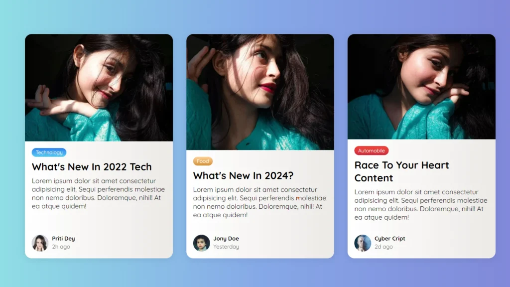
Let’s dive into the realm of modern blog design with our tutorial on Responsive Blog Post Card Design Using HTML & CSS
SOURCE CODE
HTML:
HTML
<!DOCTYPE html>
<html>
<!-- coded by : cybercript.in -->

<head>
  <meta charset="UTF-8">
  <title>Cyber Cript-Blogpost Card</title>
  <link rel="stylesheet" href="css/style.css">
  <meta name="viewport" content="width=device-width, initial-scale=1.0">
  <script src="https://kit.fontawesome.com/b99e675b6e.js"></script>
</head>

<body>
  <!-- coded by : cybercript.in -->

  <div class="container">
    <div class="card">
      <div class="card__header">
        <img src="images/card-img-2.jpeg" alt="card__image" class="card__image" width="600">
      </div>
      <div class="card__body">
        <span class="tag tag-blue">Technology</span>
        <h4>What's new in 2024 Tech</h4>
        <p>Lorem ipsum dolor sit amet consectetur adipisicing elit. Sequi perferendis molestiae non nemo doloribus.
          Doloremque, nihil! At ea atque quidem!</p>
      </div>
      <div class="card__footer">
        <div class="user">
          <img src="https://i.pravatar.cc/40?img=1" alt="user__image" class="user__image">
          <div class="user__info">
            <h5>Priti Dey</h5>
            <small>2h ago</small>
          </div>
        </div>
      </div>
    </div>
    <div class="card">
      <div class="card__header">
        <img src="images/card-img-1.jpeg" alt="card__image" class="card__image" width="600">
      </div>
      <div class="card__body">
        <span class="tag tag-brown">Food</span>
        <h4>Latest update of AI in 2024</h4>
        <p>Lorem ipsum dolor sit amet consectetur adipisicing elit. Sequi perferendis molestiae non nemo doloribus.
          Doloremque, nihil! At ea atque quidem!</p>
      </div>
      <div class="card__footer">
        <div class="user">
          <img src="https://i.pravatar.cc/40?img=2" alt="user__image" class="user__image">
          <div class="user__info">
            <h5>Jony Doe</h5>
            <small>Yesterday</small>
          </div>
        </div>
      </div>
    </div>
    <!-- coded by : cybercript.in -->

    <div class="card">
      <div class="card__header">
        <img src="images/card-img-3.jpeg" alt="card__image" class="card__image" width="600">
      </div>
      <div class="card__body">
        <span class="tag tag-red">Automobile</span>
        <h4>Race to your heart content</h4>
        <p>Lorem ipsum dolor sit amet consectetur adipisicing elit. Sequi perferendis molestiae non nemo doloribus.
          Doloremque, nihil! At ea atque quidem!</p>
      </div>
      <div class="card__footer">
        <div class="user">
          <img src="https://i.pravatar.cc/40?img=3" alt="user__image" class="user__image">
          <div class="user__info">
            <h5>Cyber Cript</h5>
            <small>2d ago</small>
          </div>
        </div>
      </div>
    </div>
  </div>
</body>
<!-- coded by : cybercript.in -->

</html>
<!-- coded by : cybercript.in -->
CSS:
CSS
@import url("https://fonts.googleapis.com/css2?family=Quicksand:wght@300..700&display=swap");

/* <!-- coded by : cybercript.in --> */
*,
*::before,
*::after {
  box-sizing: border-box;
  padding: 0;
  margin: 0;
}

body {
  font-family: "Quicksand", sans-serif;
  display: grid;
  place-items: center;
  height: 100vh;
  background: #7f7fd5;
  background: linear-gradient(to right, #91eae4, #86a8e7, #7f7fd5);
}

.container {
  display: flex;
  flex-wrap: wrap;
  justify-content: center;
  max-width: 1200px;
  margin-block: 2rem;
  gap: 2rem;
}

img {
  max-width: 100%;
  display: block;
  object-fit: cover;
}

.card {
  display: flex;
  flex-direction: column;
  width: clamp(20rem, calc(20rem + 2vw), 22rem);
  overflow: hidden;
  box-shadow: 0 .1rem 1rem rgba(0, 0, 0, 0.1);
  border-radius: 1em;
  background: #ECE9E6;
  background: linear-gradient(to right, #FFFFFF, #ECE9E6);

}

.card__body {
  padding: 1rem;
  display: flex;
  flex-direction: column;
  gap: .5rem;
}

/* <!-- coded by : cybercript.in --> */
.tag {
  align-self: flex-start;
  padding: .25em .75em;
  border-radius: 1em;
  font-size: .75rem;
}

.tag+.tag {
  margin-left: .5em;
}

.tag-blue {
  background: #56CCF2;
  background: linear-gradient(to bottom, #2F80ED, #56CCF2);
  color: #fafafa;
}

/* <!-- coded by : cybercript.in --> */
.tag-brown {
  background: #D1913C;
  background: linear-gradient(to bottom, #FFD194, #D1913C);
  color: #fafafa;
}

.tag-red {
  background: #cb2d3e;
  background: linear-gradient(to bottom, #ef473a, #cb2d3e);
  color: #fafafa;
}

.card__body h4 {
  font-size: 1.5rem;
  text-transform: capitalize;
}

/* <!-- coded by : cybercript.in --> */
.card__footer {
  display: flex;
  padding: 1rem;
  margin-top: auto;
}

.user {
  display: flex;
  gap: .5rem;
}

.user__image {
  border-radius: 50%;
}

.user__info>small {
  color: #666;
}
/* <!-- coded by : cybercript.in --> */
Animated Login and Signup Form Using HTML CSS & JS
In this tutorial, we are creating an Animated Login and Signup…
Download Source Code
Conclusion:
And there you go – Responsive Blog Post Card Design Using HTML & CSS. You can modify the styles, extend them with new features, or use them in your projects to provide stylish visuals for the users.